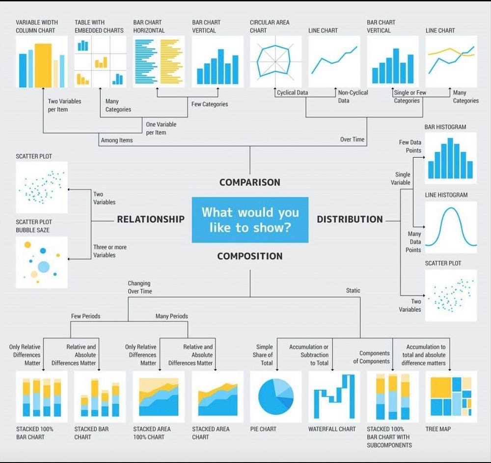
Discover the Python Powerhouse: 10 Libraries That Take Data Visualization to New Heights
Introduction
Hey, there! I’m Gabe, and I am passionate about teaching others about Python and Machine Learning. With over a decade of experience in data analysis and visualization, I have come across numerous tools and techniques that make the process both efficient and captivating.
In this blog post, I want to share with you my top 10 Python libraries that outperform the competition when it comes to data visualization.
1. Plotly: Interactive Visualizations Like Never Before
When it comes to creating interactive and stunning visualizations, I believe Plotly is the go-to library. With its intuitive interface and rich set of features, I think Plotly empowers data analysts and visualization enthusiasts to bring their data to life.
This is what I would do to create an interactive bar chart using Plotly:
import plotly.express as px

data = {'Category': ['A', 'B', 'C'], 'Value': [10, 15, 7]}
df = pd.DataFrame(data)
fig = px.bar(df, x='Category', y='Value')
fig.show()
2. Seaborn: Beauty and Simplicity Combined
When it comes to creating visually appealing and informative statistical graphics, Seaborn is my go-to library. I think Seaborn’s elegant and concise syntax makes it a breeze to generate complex visualizations.
import seaborn as sns

tips = sns.load_dataset('tips')
sns.boxplot(x='day', y='total_bill', data=tips)
3. Matplotlib: The Classic Choice for Versatile Visualizations
Matplotlib has been around for a long time, and I believe it deserves a special place in the hearts of data analysts and visualization enthusiasts. With its extensive functionality and flexibility, I think Matplotlib allows you to create a wide range of visualizations.
Keep reading with a 7-day free trial
Subscribe to The Father Gap to keep reading this post and get 7 days of free access to the full post archives.


