Power BI Visualization Types: A Comprehensive Guide to Creating Engaging Reports
If you are a Power BI developer, it’s a good idea to save this article for future reference. It will be invaluable whenever you need to create any of these visualizations.
Visualization Types in Power BI
Power BI offers a wide range of visualization types that allow users to create visually appealing and interactive reports and dashboards.
These visualization types in Power BI provide a wide range of options for analyzing and presenting data. By following the step-by-step instructions and understanding their use cases, you can effectively create compelling visualizations that convey insights and drive data-driven decisions.
In this blog post, we will explore popular visualization types in Power BI and provide step-by-step instructions on how to create them. Let’s dive in!
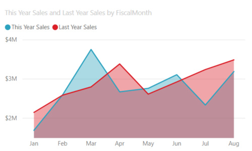
Area Charts: Basic (Layered) and Stacked

Step-by-step: To create an area chart in Power BI, follow these steps:
Open Power BI and load your data.
Drag and drop the desired field representing the time or X-axis onto the Axis field well.
Drag and drop the field(s) representing the values onto the Values field well.
Click on the “Visualizations” pane, select the “Area chart” icon, and customize the chart as needed.
Use case: Area charts are useful for showcasing the magnitude of change over time. They are commonly used to display trends, such as profit over time, and emphasize the total value across a trend.
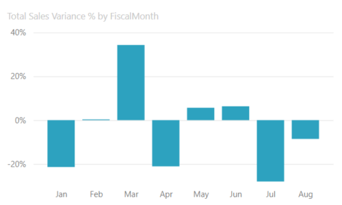
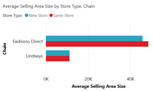
Bar and Column Charts


Step-by-step: To create a bar or column chart in Power BI, follow these steps:
Load your data into Power BI.
Drag and drop the field representing the categories onto the Axis field well.
Drag and drop the field representing the values onto the Values field well.
Click on the “Visualizations” pane, select either the “Bar chart” or “Column chart” icon, and customize the chart as desired.
Use case: Bar and column charts are effective for comparing values across different categories. They are commonly used to visualize sales by product, market share by region, or revenue by department.
Keep reading with a 7-day free trial
Subscribe to The Father Gap to keep reading this post and get 7 days of free access to the full post archives.


